A Postcard From 1926: Any place as a vintage travel postcard.
Round 5
Image 2 - "Dear Future, We Were Here" : 3.34
This is the postcard every reader had already printed in their head before opening the page: the Statue in the foreground, the skyline across the water, a steamer trailing smoke toward the right margin. It is handsome and it is furniture, meaning nothing in it is seen through a particular pair of eyes, and a card written to the future needed one detail only a traveller of that year would have noticed, a ferry rail, a cold morning, a face at the dock.
Image 1 - "Greetings from the Future Past" : 3.55
A whole Saturday matinee crammed onto one card, red bus, Big Ben, rain-glazed pavement, a fur-collared couple, a newspaper shouting about a new era, and the energy is real. But the picture keeps elbowing the viewer like a tour guide in a hurry, which is to say every element is lit and sharpened to the same pitch, so the wet street that could have carried the whole mood is buried under props; drop the slogan and half the crowd and the reflections alone would have done the talking.
Image 3 - "I Was There" : 3.72
The only entry that feels found rather than made, a hand-tinted photograph with the colour of weak tea, cypresses standing guard over the domes and a boxy motorcar idling on the cobbles. Its restraint is its whole argument, and also its ceiling: the crowd stands in a polite row across the middle of the frame, so the eye takes in Istanbul as a diorama when one figure turning toward the lens, the "I" of the title, would have made the witness visible.
Image 4 - "Memories from the Provisional Capital" : 3.86
The title carries a secret the picture then pays off: in 1926 Kaunas was a capital by necessity rather than by birthright, standing in for a Vilnius it could not reach, and this card treats that borrowed crown with tender seriousness. The bird's-eye view, a warm lithograph of red roofs, baroque towers and the castle where the two rivers braid together, is the exact visual language civic pride spoke in that decade, so the form itself becomes the argument that this town was making itself grand on purpose. There is a faint ache under the cheer, the knowledge that "provisional" is a word written in pencil, and that undertone is what lifts it above the more polished competition. It stops short of 4.00 because the lettering sits small and timid at the bottom of an image that deserved a bolder banner, and the dense middle ground blurs into texture where one sunlit square could have pulled the eye home. My winner.
──────────────
Four cities, and the contest came down to memory versus monument. Image 3 nearly took it by refusing to perform, the quietest and most believable object on the table, but Image 4 smuggled a piece of history into its title and let the picture keep the promise, which is more than any postcard owes its sender.
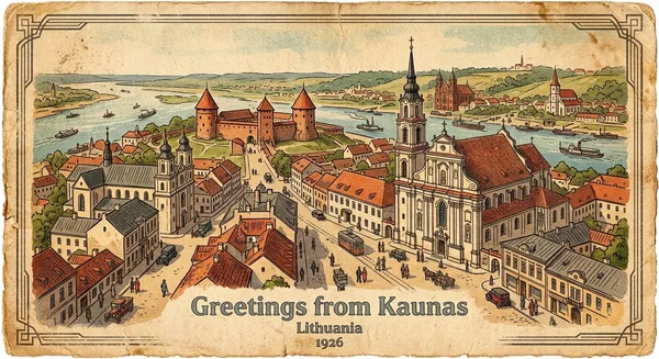
Memories from the Provisional Capital
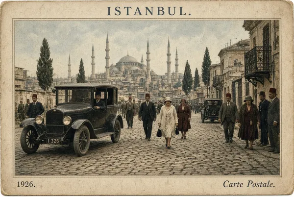
I Was There
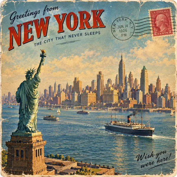
Dear Future, We Were Here
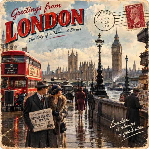
Greetings from the Future Past
Only this tournament's players rate.